Tuesday 26 November 2019

Hidatsa Character - Sculpt 2

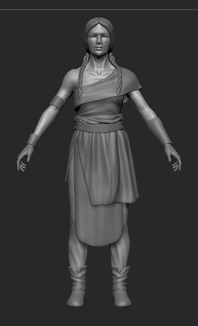
Spent the last half of the first week detailing the sculpt. I found doing an old person quite challenging and more time consuming. For my face sculpt, I used a lot of references of old native american women and tried replicating their features. I used references of old women from different tribes for the rest of the body as well and tried to make the details consistent and really give the impression that the character is aged. Still because of time constraints and wanting to finish the sculpt in one week, I had to be selective with the details that I would have on the body, so I spent the most time working on the face and hands.
When sculpting them, I started very broad to get the main shapes and proportions in place, and then worked my through secondary forms like the main wrinkles and skin folds. At first, I kept everything symmetrical so I could get the details done more quickly, but afterwards went back and changed the shapes on half of the face. Also, I added a scar on one side of her face to help with the asymmetry and because I figured that as a warrior, it wouldn't be uncommon for her to have scars. I am thinking of adding some more scars on the rest of her body if I finish in time. For the small skin details, I added noise to quickly have some pores covering the skin and then added more particular pores with alpha maps, on multiple layers so I could quickly tweak them if necessary.


For her overall build, I wanted to make it slim but still fairly toned and used references of old people who are very sporty and active, and noticed that their muscles were still quite toned and only the skin lost its elasticity and was hanging in certain areas. I wanted to keep the hands at the same level as the face so I spent some more time working on them to add wrinkles and skin folds. Looking at old women's hand pictures I noticed that the skin looks thinner, almost translucent in a way, and the veins are showing a lot, so I tried doing that on my sculpt as well. Also, changed the position of the fingers a bit because I felt like they were too bend before.


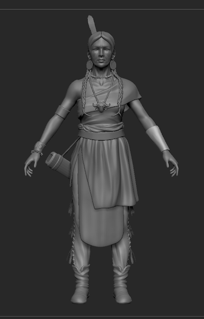
For the rest of the model, I had the same approach as until now, so I went back to each of parts, subdivided them and added more details on layers. Still, I didn't want to bother with adding stitches, cuts and things like that at this point, because I would that in the textures. Also, changed the pendant of the necklace completely because I was not happy with how it was turning out, instead I found a reference of a bird shaped necklace with a stone on it and changed it to that. I added some antlers at the end of the braids to give them more weight and thought it would be a nice detail, still keeping in the theme of the character. For the hair, I wanted to make a base sculpt in Zbrush and then add more details to it with hair cards, because I thought that having braids completely made out of hair cards would be very budget expensive and time consuming. 
The only things that I would still want to add to the model would be more feathers to decorate the quiver and maybe some tassels at the edge of the cloth wrapped around her waist but I am not completely sure about it. I would also want to make some arrows and a long bow, but I am planning to make all of them directly in 3ds Max.


At this point, I would call the sculpt done and it is time to start the low poly, on which I will work through the second week of the project.


Monday 25 November 2019

Hidatsa Character - Sculpt 1

For this project I've decided to make my own concept because I couldn't find one that was fitting. I started by gathering a lot of reference about hidatsa people, their clothing, accessories and also took some inspiration from the Wild West challenge on Artstation. In the end I decided to make an old warrior lady who uses a long bow as her weapon of choice and in her design I incorporated features which I've seen on many native american people, like the dress with a piece of cloth tied on the waist for women, tasellated paints, soft leather boots, twin braids hairstyle, multiplte necklaces and bracelets with traditional motifs, but I still took my creative freedom with it and didn't make it completely historically accurate. Trying to balance the details and keep simple but still interesting in terms of accessories, which are quite complex in real life, I decided to just have a beaded necklace and bracelet, circular earrings, a long necklace with a big pendant, a leather bracelet with metal decorations, a metal upper arm bracelet and an leather armguard (for using the bow). In the case of the pants, rather than having them tassellated on the whole length, I preferred to just have a few tassel to get the idea across, the other pieces of clothing I would like to keep simple and detail them with the textures by adding patterns.
I didn't actually spent a lot of time creating a polished concept as it wasn't necessary, I just made a quick sketch for myself to see the main features that I want and then quickly blocked it in in Zbrush, and then made an overpaint of the model to decide on the final elements.


I started with a quick block in of the body, I didn't want to have it too detailed at first, just something to get the proportions right and make the clothes on top. One of my main goals with this project was to learn Marvelous Designer, which I used to create the top, waist cloth, skirt and pants. I watched a few introduction tutorials on it to get a sense for the interface and basic tools, and I didn't find that difficult to work with and create the pieces of clothing the way that I wanted. After importing the clothes to Zbrush I spent a bit more time on them to clean up the topology and fix some of the folds.
Next thing that I blocked in were the belt, bracelets and shoes. For the hair, I made the main hair cap from a sphere and the braids using Zspheres by creating the zig zag shape for one of the three hair strands of a braid and then duplicated it 2 times for the other strands, putting them in the right position and at the end, inflated them to close up the holes.

Marvelous Imports^


The next things that I wanted to get in were the accessories. Most of them I sculpted directly in Zbrush starting from primitive shapes. Made a feather hair ornament, circular earrings and a buffalo head pendant. For the beaded necklace and bracelet, I created 4 types of beads and made an insert mesh brush from them and used it in curve mode to create a string of beads where I wanted to place them. Also, I blocked in in 3dsMax a quiver to quickly place on the model and figure out the right position. For the pants, I decided to have a few tassels on the side and have stitches going from top to bottom.


At this point, I had all the main parts of the character in place, so the next step is to go back and detail everything over the next couple of days. 
This is the work that I managed to get done in the first 3 days of the project.

Monday 18 November 2019

SO Character - Presentation & hand-in

In the last week of the project I started working on the rig. I wanted to do it in Maya, mainly because I haven't done it before and wanted to learn it. Setting up the rig with the human preset was not that hard, pretty similar to using the biped in 3dsMax. I found skinning much nicer than it is 3dsMax and quicker but half way though the process I realised that some vertices that I have already worked on kept resetting their weights and messing up the entire skin. I have tried looking for a solution but nothing that I did fixed it, the only answer that I found was that it is a bug in Maya and I should just restart the skin. Unfortunately, at this point I didn't have enough time to finish it until the deadline and I preferred to work on the presentation in Marmoset. I am a bit disappointed that I couldn't manage to finish the rig until the hand-in but I will do it until the summative submission. This time I want to take my time with it and make it nicer, because I found rigging this character more difficult as it has a lot of overlapped, hanging pieces of clothing and  I don't want to get any errors in my model caused by the rig and skin.
For the Marmoset scene, I tried having a similar lighting set up as in the concept. My main focus was to create interesting shadows and draw the attention towards the top of the character, but the current lighting set up is likely to change a bit after I pose the character. For the final presentation, I am planning to make some glowing smoke alphas for the katana to imitate the effect it has in the concept and add a backdrop in the scene, with maybe some mist/smoke or dust particles.


SO Character - Hair

The hair was one of the most challenging parts of the project and the one that slowed me down the most. I had to go through a lot of trial and error before finding a good way to do it for this character.
Initially, I sculpted the hair in Zbrush and was planning to use that and maybe add some hair planes, but after thinking for a bit I decided to make the hair entirely of hair planes because it is something I've never done before and wanted to learn it. I spent a few days researching and looking at different tutorials on ways to do it, some were using fiber mesh in Zbrush, others xGen in Maya or 3ds Max. The simplest way of creating the hair texture that I found was using the Hair Strand Designer from Artstation Marketplace, it gives pretty good results quickly and generates all the necessary maps, and it's also very easy to learn. In the beginning I created my hair textures using this program and started placing them around. After about one day of work in which I covered the entire head, I realised that this is not the best way of making this particular hairstyle and it would probably take me a lot of time to get some decent results and I didn't think I could be able to finish it until the deadline.
So I gave up on this idea and starting looking into other ways of doing it. The character's hairstyle is quite stylised and I couldn't find any life references for it, so I used references from Final Fantasy games, which have similar hairstyles that also look quite realistic (for example, Final Fantasy XV). Most of the references that I used were from Final Fantasy XIII and XIV, I tried looking at how they do the hair and how their textures look and I could find the 3D model for on the characters from XIII which was quite interesting to see. What also helped me a lot, was using the online dressing room for Final Fantasy XIV where you could see the 3D models and change their hair styles, so I used that to see how they places the haird planes and how they painted the textures.
After all this, I decided to hand paint my textures and created 4 really dense hair strands which I used to cover the entire head so the character wouldn't have any bald spots. The way I placed the hair cards was by using splines in 3dsMax, I made the planes for the hair with a little curve on the Y axis, which was more accentuated at the bottom than the top. Placing them took a lot of time in general and because I had to keep exporting them to Marmoset to see how they would look, as 3dsMax wasn't displaying the alpha maps properly and I couldn't always see what I was doing.
I ended up painting 4 more hair strands which were a little less dense to add more variety to the hair, and then one more strand which was really thin for fly away hairs, so in total, I had 9 different layers of hair, some of which had only 15-20 planes and others which had 70-80 planes.
At the end, I created a normal and roughness map in Photoshop for it and also painted some eyelashes.


In total, the hair has around 5k tris. It took almost an entire week to get it done, but some of the days were wasted (except for exercise) on different attempts until I figured out how to do it. Overall, I am glad I managed to get it done even though I am not entirely happy with how it turned out and the fact that it doesn't match the hairstyle from the concept too well. At this point I'm feeling it's too messy and I would like to be able to make the hair clumps look more organised, but I still need to study and practice more until I'll be able to get a nicer result for this hairstyle.

Sunday 17 November 2019

SO Character - Textures 2

The next part was adding details to the materials, I added more color variations as the concept is quite vibrant, but I tried having the most saturated colors around the head and torso to draw the attention to them. I went through all of the materials and started refining them, trying to keep them at the same detail level and be more consistent with them.
Also, after getting feedback I went back to the low poly model and modified the eyes, as they were to open and the character had a weird expression. Thinking about how to give more personality to the character, I added some smudged eye make-up, because I felt like it matched the character's mood and outfit and also made the eyes have slightly different colors, but I kept it quite subtle because I wanted it to be a small detail, rather than a main feature.  I painted the area on the head where the hair is supposed the be the same color as the hair, just to make sure it wouldn't be noticeable through the hair cards.


For the mask, I just added some edge wear, scratches and noise, I didn't want to make it very damaged so I kept their intensity a bit lower. Also, I added a skull paint on the side of the mask, mainly for trying to add personality.
I kept the t-shirt quite simple, and only added some color variation to it, stitches around the edges and the pattern it had in the concept. Even though, the t-shirt is supposed to be black, I tried playing with some dark, desaturated colors a little to make it more interesting than just having it flat black and added a blue gradient from the top, to bring the attention to the upper part of the torso.
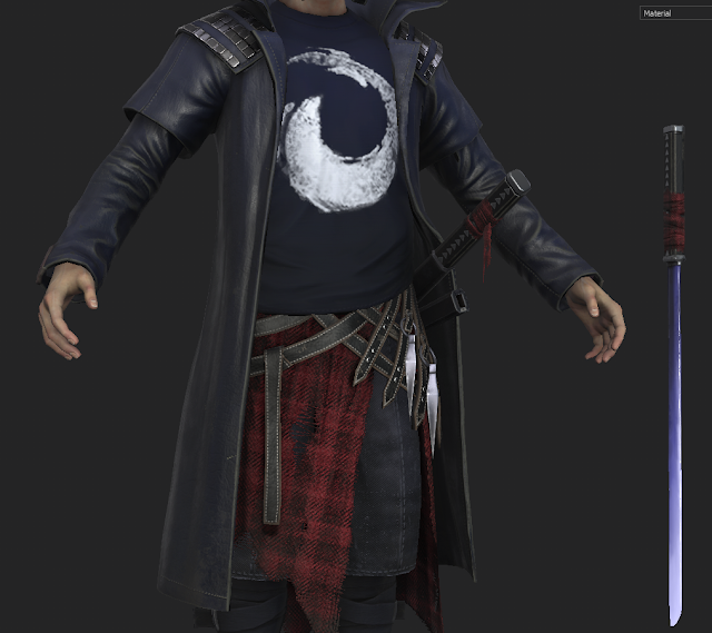

I created an alpha map for the cloth around his waist and looked up some tutorials on making torn fabric in Substance Painter. I ended up making in in three simple steps, the first one was going over all the edges with an artistic brush so there wouldn't be any sharp, straight edges left and also made some holes in the fabric; next step was going over everything again, but this time with a grid brush which would suggest the fabric weaves, and lastly, I painted more fly-away strands with the basic hard brush. I think this method gave me a pretty nice result. After getting more feedback, I realised that the piece of cloth was looking too flat, so I painted more folds on multiple height layers with different intensities and also toned down the saturation because it was drawing the attention too much.
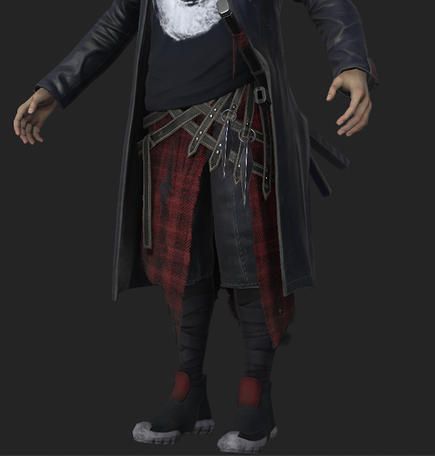

For his belts, I added some stitches and a light brown color on the edges, looking at some real life belts references. I wanted to make the wraps on his legs some stretchy, sport fabric and his shoes some kind of running sneakers without laces, from a breathable fabric. Also, I toned down the white part of the shoes quite a lot because it was too bright and drawing too much unwanted attention.
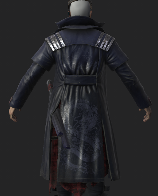
I spent quite a bit more time working on the coat because it is a big part of the character. I looked up at many types of leather coats to see what details I could add to it and where to place the stitches. I added some desaturated, light brown wear around the edges which I think helped with the realism, also added some light damage to it. On the shoulder and neck area I added a light blue gradient so it would draw the attention towards the head of the character. On the back of the coat, I added a dragon pattern and a Japanese style inspired cloud pattern. Even though, they were not in the concept, I think it still matches the samurai inspired theme of the character and it would be a nice detail. Still, I wanted to keep it subtle so I only made them a slightly different color and made the biggest change in the roughness. Also, I added those thinking about Sunset Overdrive, which is a third-person game and the character would be mainly seen from the back, so having some details there would make it more interesting to look at.

When working on the weapons, I first made a standard metal material for them and made them look like regular weapons, then I added an emissive map to imitate the look the katana has in the concept which I think it's really interesting. For the handle, I tried suggesting the look a traditional katana's handle has, this is why I added the metal triangular shapes over the leather covered handle, which also matched quite well the concept. Also, I realised I forgot to add the wraps the katana's have on the handle in the concept, so I added them directly in Substance, making them the same material like the cloth on his waist and painting the folds with height layers, only went back to 3ds Max to add a plane for a hanging piece of fabric for the sheathed sword. I didn't add a hanging piece for the other katana because he would hold it in his hand so it would probably only get in the way. The sheath I kept quite simple and only made a color gradient from the bottom and added some cherry tree flower pattern, to keep the theme of the character.
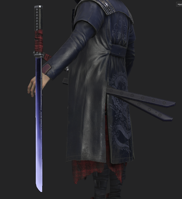

Overall, I didn't want to add too much wear and damage to the character so I kept it more subtle, only visible in certain places which would make sense to be worn. At the end I went back and added dirt layers, trying to keep them more intense in the lower part of the character. Also, I made another layer to reinforce the AO Map and then manualy painted on top of it to get nicer transitions between the materials, for example, between the face and the mask, the coat and the t-shirt, the coat and the hands, the belts and the pants and the wraps on his legs. 


This is how the final textures turned out, after this stage I only made small tweaks after setting up the lighting in Marmoset Toolbag. Overall, I am pleased with how the materials turned out and I am happy I got to learn a lot from working on this character. Now my main focus is the hair which needs a lot more work before being done.
The textures took me roughly 3 days to get to this stage.

Friday 15 November 2019

SO Character - Textures 1

My main goal with this project's materials was to learn how to do fabric, as I find quite difficult to make it look believable. This character gave me the opportunity to experiment with different types of fabrics and I tried to treat each part as different as I could, so I tried having some kind of soft t-shirt fabric, something flannel like for the cloth around his waist, denim for the pants, something like an elastic sports fabric for the wraps on his legs and some soft, breathable material on the shoes.
I spent some time researching how to make these materials look right and what helped me the most was looking at how other people do it, I watched a few tutorials online of people doing their own materials, read a few articles on 80lvl and also downloaded some free cloth materials for Susbtance Painter. I only used these for studying, not on my actual character, and the way I did it was by disabling all of their layers and then slowly going through each of them and try to understand what they do, why and how they do it; then I tried replicating them myself. I found this was a very good exercise and I learnt a lot of things I couldn't have learnt otherwise, like layering more height layers to create the cloth texture, using a wrap filter for diversity in the fibers, using clouds fill layer to break up texture details, as well as create small clumps in the fabric with noise filters and what a lot of layer blending modes I haven't used before do. Also, learnt more about layer masking and how to control it better. All these things, I tried applying when I made the materials for my character and I think they helped me achieve a better result, closer to what I wanted them to look like.
In the first stages of working on the textures, I tried keeping everything at the same level of detail to help me get a more consistent look for the final version, so I made some bases for all the materials which would only define their properties, color, roughness, texture, but without adding details like wear, dirt, scratches, patterns or stitches.


This is how the character was looking with only the bases, I ended up going back and added a lot more variation to them and also changed the colors a bit. At this stage, my main focus was to define what each material is supposed to be and have everything prepared to add more interesting details and wear.
I managed to get this done in roughly one day of work.

Monday 11 November 2019

SO Character - UV&Bake

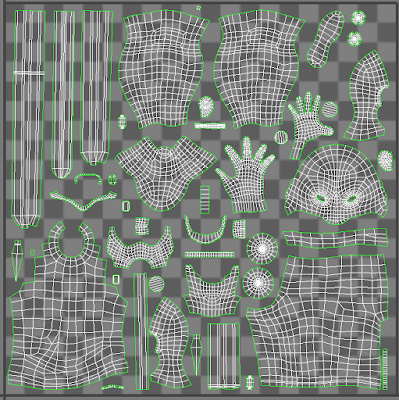
For the UVs, I split all parts of the character on the 2 texture sheets that we have in the budget. I kept the same type of material on the same texture sheet and reused some of the textures, I mirrored the hands since they wouldn't have any distinctive features, the shoes, the pants (half of them are completely covered), the kunais and the cylindrical parts of the mask. I tried keeping the same density on all parts of the characters, except for the head and hands which have a bit more texture space and the eyeballs, just so the bakes would turn out well and I will be able to add enough details to them.
I am planning to add another texture sheet for the hair because having the hair cards alphas on the same sheets as the rest of the character would make them look really pixelated and I want to have a good definition to them. I am still thinking how to split the texture budget for the submission, but I think that in this way I will get the best looking results.


I baked the character in Marmoset Toolbag. I split the model in 2 bakers and had a different baking group for each part of the mesh, so I wouldn't get as many errors. Most of the bakes turned out ok and I only had some minor errors to fix which I did directly in Marmoset. For the coat I got the most baking errors and had to edit them in Photoshop. It took me a few hours to clean up all the bakes and then AO map but I managed to get them to look better.


After that, I imported the model in Substance Painter and the Normal map, Normal Space, AO and Curvature map from Marmoset. I created folders for every different material on my character and assigned some base colours, so now I am ready to start texturing.
I only managed to get the character into Substance at the end of the third week because I spent the rest of the week working on the hair and trying to find a good method to do it for this character ( the whole hair process I will detail in another blog post).
My main focus now is getting the textures to a good level of detail as quickly as possible and get the hair to look decent.

Monday 4 November 2019

SO Character - Low poly

Tuesday, second week of the project, I started doing the low poly model. Firstly, I grouped some subtools in Zbrush which would make sense to be a single mesh, so I could retop them easily (merged the sides, back, shoulder pads and collar of the coat, the belts on each side, leg wraps, mask parts). 
For a part of the objects I made the low poly directly in Zbrush by going back to my lowest subdivision which had clean topology and eventually using Zremesh to go even lower, I made the belts, weapons and mask this way. The other objects I retpologised in 3D Coat and then made the final adjustments in 3dsMax. For the pieces of clothing, like the coat, t-shirt, pants, cloth, I focused at first on getting the edge loops flow right so they would deform well, and after that I went back and worked on the areas with the strongest folds, adding triangles and cuts which would follow the shape of the folds, but still keeping the edge loop. This is a method I've seen used by many senior artists when making clothes and I really wanted to give it a try and get accustomed to it, because I think that it gives nicer baking results while still keeping a clean topology. I've still got a lot to learn about making topology by I am trying to implement small changes in every project that I make and slowly get better. Also, I tried to align the loops on different objects which overlap so they would deform uniformly.


Probably the most difficult object to retop was the coat and I had to make a lot of changes until I got the result that I wanted. Initially, I wanted to keep the shoulder pads and coat as one objects but after trying that I realised that it isn't actually a very good idea and wouldn't look great so I split them up. To add thickness to the coat I used the shell modifier in 3dsMax, I then edited the result and deleted all the hidden polygons. 
Also, I made some proper eyeballs which follow the human anatomy, I made a mesh for the inner part of the eye with the iris and pupil and another one, like a lens on top for the cornea. 
Changed the low poly model for the katanas as well, I made 2 versions, one which is sheathed and one with the actual blade, as I wanted the character to hold that in his hand, like in the concept.
After I finished all the pieces, I got around 18.5k tris and I am quite pleased with this tris count as it would allow me to spent the rest on the hair, but it might change depending on how the bakes are turning out. Also, managed to get everything unwrapped but I still have to pack it properly. 
Everything took roughly 4 days. 
The next thing I am focusing on is making the hair and hair cards which I find quite challenging to get right, I am looking up different tutorials and methods on doing it but I've still got to do more research before getting it done.


Sunday 3 November 2019

SO Character - Sculpt 2

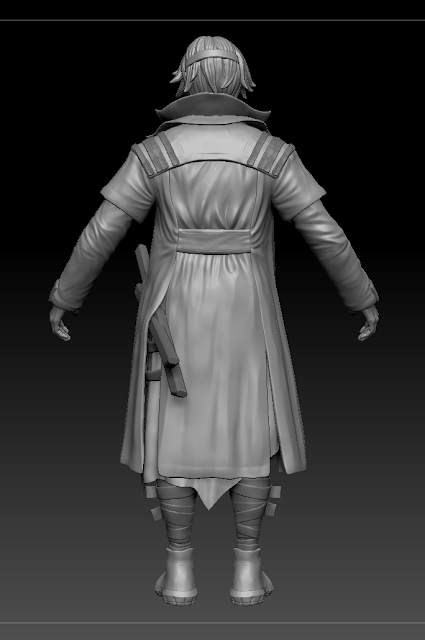
I spent the next day working on the coat. Firstly, I positioned the katanas and moved the coat on top of them as in the concept, it was a bit tricky to get it in the right position but I used the move brush and move tool with masking to pose it and then resculpted some bits which needed more adjustments. After that I started sculpting the folds and I didn't want to use symmetry at all so I could make them all different. Getting them right was a bit challenging because I wanted to make the coat out of leather and looking at real life references, leathers jackets and such tend to to have a lot of folds and get really wrinkly, which was hard to translate in my model without making it too noisy.


I got some feedback on the folds and I realised that I overworked it and I should tune it down in some areas and only keep more defined folds on the areas which would bend (around the armpits, elbows). Fortunately, I sculpted all the details on the coat on different layers and it wasn't that complicated to change it, I just took out some layers and softened others. I tried to find a balance and have enough resting space without giving up on all the sharper folds which would appear on a leather jacket and after changing it, it started looking a little better and more realistic. 
Even though I could spend another few days just working on the coat there are still areas of the characters which need to be finished so I had to move on, as I wanted to be finished with the sculpt in one week. 
The next thing I worked on is the hair. I wanted to make a base hair mesh in Zbrush and the use hair cards to add more details to it and get the same fluffy feeling it has in the concept. Spent some time sculpting the hair strands on the base and positioning it in the right shape but I wanted to keep the silhouette fairly simple and not add too many hair locks. 


After I got all the main things done, I started going over all of the parts again and fix everything to finish it off. Got more feedback and realised that the t-shirt was looking too symmetric and changed to go over the katanas, rather than be tucked under them, also softened the folds on the chest a bit more. Worked on the coat collar more and tried to make it more asymmetric, added some bands which were missing on the the sleeves. Changed the folds on the piece of cloth around his waist as well and tried to make less repetitive. Also, broke the symmetry of the wraps around his legs and refined the shape of the shoes a bit more. I changed the position of the belts a little to make it work better and added some studs that were missing and some pieces which would hold the kunais in place, I tried to make them look as you could detach them from one side, so it would be actually possible to use the kunais.
I worked on the face and hands a bit more. For the face, I tried to keep some sharp angles as I had seen on many characters from Sunset Overdrive. I also added some skin pores but I kept them very subtle to fit the style of the game. I did some more work on the hands, fixed their shape and added more details, veins and tendons. 
I really tried making the character match the style of Sunset Overdrive and constantly looked at the characters in the game when sculpting. Also, I found some sculpts of the characters as well which were really useful to see how things are supposed to look. 


At this point, I was fairly happy with how to sculpt was looking and decided it was time to move on if I want to finish everything in time. I didn't want to change anything affecting the silhouette anymore so I could start the low poly model, and if I had time after that I could come back and make small changes to the sculpt.
Manged to finish the sculpt in roughly 6 days of work.